Photo Shoot Color Scheme Suggestions
Is this tool helpful?
How to Use the Color Scheme Suggestion Tool for Photo Shoots Effectively
You can use this tool to find the perfect color palette for your photo shoot by entering clear details about your creative vision and shoot conditions. Follow these steps:
-
Type of photo shoot: Specify the style or genre of your shoot. For example:
- Outdoor family reunion
- High-end product showcase
-
Expected lighting conditions: Describe the lighting you plan to use, such as:
- Golden hour sunlight
- Indoor ambient light with candles
-
Description of the background or location: Share details about the shoot environment, for example:
- Industrial warehouse with metal textures
- Vintage café interior
-
Overall mood or atmosphere: Define the emotion or vibe you want, such as:
- Joyful and lively
- Moody and dramatic
-
Clothing and props (Optional): Mention any important wardrobe pieces or props:
- Casual denim jackets and hats
- Classic leather handbags and sunglasses
-
Theme or concept (Optional): If your shoot follows a special theme, enter it here, for example:
- Bohemian festival vibe
- Mid-century modern elegance
After filling out the required fields and optional details if applicable, click “Get Color Scheme Suggestions.” The tool will generate color palette recommendations tailored to your inputs, helping you visualize and plan your shoot’s aesthetic with confidence.
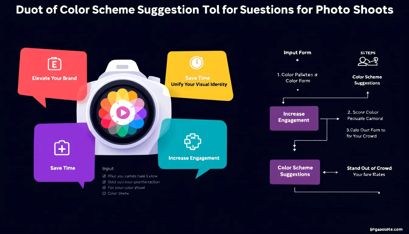
Introduction to the Photo Shoot Color Scheme Suggestion Tool: Definition, Purpose, and Benefits
Color plays a crucial role in photography — it influences mood, sets tone, and brings visual unity to your images. This Color Scheme Suggestion Tool acts as a virtual color consultant, guiding you to craft visually pleasing and emotionally engaging photographs across different photography styles.
By combining principles of color theory, psychological color impact, and real-world photographic experience, the tool offers personalized color palette ideas. Whether you shoot portraits, fashion editorials, product photos, or events, it helps you choose colors that elevate your creative direction and streamline your planning process.
Why Use Color Scheme Suggestions in Your Photography?
This tool saves time, inspires creativity, and improves communication by:
- Creating visual harmony among shoot elements
- Enhancing emotional resonance in your photos
- Reducing guesswork in color choices
- Providing inspiration for styling, props, and post-processing
- Facilitating clear color direction with clients
- Encouraging consistent color themes across projects
Using the tool regularly will also deepen your understanding of color relationships, making your photographic work more intentional and refined over time.
Practical Uses of the Color Scheme Suggestion Tool for Different Photography Genres
Wedding Photography
Wedding photographers can design cohesive color themes that unify the entire event look—from attire to floral decor—by inputting details such as venue, lighting, and desired mood.
Example:
- Type of shoot: Beach wedding at sunset
- Lighting: Warm, golden hour natural light
- Background: Ocean shore with sand dunes
- Mood: Elegant and relaxed
The tool might recommend a palette of soft blush pink, sandy beige, seafoam green, and coral tones. This helps you plan matching bridesmaids’ dresses, bouquets, and décor elements that create an effortless, harmonious aesthetic.
Fashion Editorials
Fashion photographers use the tool for conceptual shoots, exploring unusual color combinations that match bold themes or moods while keeping the imagery connected visually.
Example:
- Type of shoot: Urban streetwear editorial
- Lighting: Overcast natural daylight
- Background: Graffiti-covered walls
- Mood: Edgy and youthful
- Theme: “Street culture fusion”
Suggested colors include neon green accents, charcoal gray, bright orange, and crisp white. These tones influence clothing choices, accessory selection, and even lighting setups like gels to reinforce the theme visually.
Product Photography
Product photographers rely on the tool to style backgrounds and props that highlight the product without overwhelming it, especially for brand-consistent or seasonal campaigns.
Example:
- Type of shoot: Luxury watch line
- Lighting: Studio softbox with reflective surfaces
- Background: Matte black with subtle texture
- Mood: Sleek and sophisticated li>
The palette might suggest gold, deep navy, charcoal, and creamy white. These colors guide your prop selection and background styling to convey a premium, timeless feel that complements the watches.
How This Tool Solves Common Color-Related Challenges in Photography
1. Overcoming Color Indecision
You may find it hard to pick colors that suit your shoot’s vision. This tool offers curated, context-aware palettes that narrow down options and boost your confidence in choosing the right colors.
Sample Scenario:
- Type of shoot: Corporate team portraits
- Lighting: Bright indoor overhead lights
- Background: Plain white wall
- Mood: Friendly and professional
You receive a palette with soft blues, light grays, and warm beige—colors that maintain professionalism while introducing warmth.
2. Aligning Mood with Color Choices
Sometimes the emotional tone you want doesn’t match your chosen colors. Our tool bridges this gap by analyzing your mood description and suggesting psychologically fitting colors.
Sample Scenario:
- Type of shoot: Children’s birthday party
- Lighting: Natural outdoor daylight
- Background: Backyard with balloons and streamers
- Mood: Fun and joyful
The tool suggests vibrant reds, cheerful yellows, and playful turquoise accents, echoing the lively atmosphere.
3. Navigating Complex Shooting Environments
Different lighting and location settings can create color challenges. The tool considers these factors to provide palettes that harmonize well in your shooting context.
Sample Scenario:
- Type of shoot: Winter outdoor engagement
- Lighting: Soft, diffused overcast light
- Background: Snow-covered forest
- Mood: Intimate and peaceful
The suggested palette features cool blues, frosty whites, muted pine green, and warm taupe, balancing cold environment tones with cozy intimacy.
Important Disclaimer
The calculations, results, and content provided by our tools are not guaranteed to be accurate, complete, or reliable. Users are responsible for verifying and interpreting the results. Our content and tools may contain errors, biases, or inconsistencies. Do not enter personal data, sensitive information, or personally identifiable information in our web forms or tools. Such data entry violates our terms of service and may result in unauthorized disclosure to third parties. We reserve the right to save inputs and outputs from our tools for the purposes of error debugging, bias identification, and performance improvement. External companies providing AI models used in our tools may also save and process data in accordance with their own policies. By using our tools, you consent to this data collection and processing. We reserve the right to limit the usage of our tools based on current usability factors.