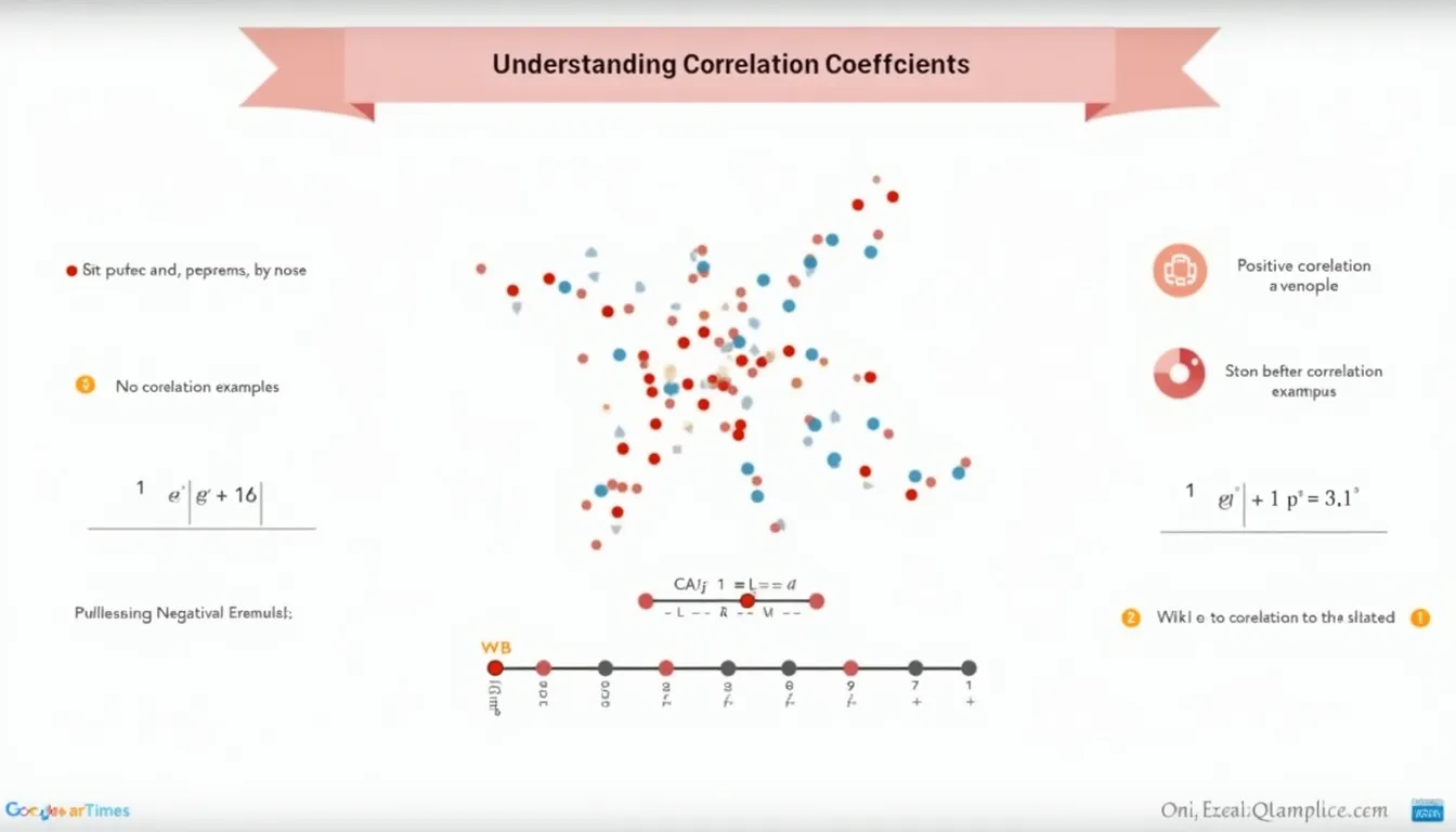
Correlation Coefficient Calculator
Is this tool helpful?
How to Use the Correlation Coefficient Calculator Effectively
Our Correlation Coefficient Calculator is designed to help you easily determine the strength and direction of the linear relationship between two variables. Here’s a step-by-step guide on how to use this powerful tool:
1. Choose Your Input Method
Start by selecting your preferred input method from the dropdown menu:
- Manual Entry: Ideal for smaller datasets or quick calculations.
- File Upload: Perfect for larger datasets or when working with pre-existing data files.
2. Enter Your Data
Depending on your chosen input method, you’ll need to provide your data as follows:
For Manual Entry:
- Data Set X: Enter your X values separated by commas. For example: 1, 2, 3, 4, 5
- Data Set Y: Enter your corresponding Y values separated by commas. For example: 2, 4, 6, 8, 10
For File Upload:
- Prepare a CSV file with two columns: one for X values and one for Y values.
- Click on the “Upload CSV File” button and select your prepared file.
3. Optional: Include Line of Best Fit
If you want to visualize the trend in your data, check the “Include Line of Best Fit” box. This will add a trend line to your scatter plot, making it easier to interpret the correlation visually.
4. Calculate the Correlation
Once you’ve entered your data, simply click the “Calculate Correlation” button. The calculator will process your input and display the results.
5. Interpret the Results
The calculator will provide you with:
- Correlation Coefficient (r): A value between -1 and 1 indicating the strength and direction of the linear relationship.
- Interpretation: A brief explanation of what the correlation coefficient means in plain language.
- Scatter Plot: A visual representation of your data points, optionally including the line of best fit.
Understanding Correlation Coefficients: Your Guide to Data Relationships
The correlation coefficient is a powerful statistical measure that quantifies the strength and direction of the linear relationship between two variables. It’s an essential tool in various fields, including statistics, data science, economics, and social sciences, helping researchers and analysts uncover patterns and make data-driven decisions.
What is a Correlation Coefficient?
A correlation coefficient, typically denoted as ‘r’, is a numerical value ranging from -1 to +1 that indicates how strongly two variables are related to each other. The sign of the coefficient indicates the direction of the relationship, while its absolute value represents the strength of the correlation.
- Positive correlation (0 < r ≤ 1): As one variable increases, the other tends to increase.
- Negative correlation (-1 ≤ r < 0): As one variable increases, the other tends to decrease.
- No correlation (r = 0): There is no linear relationship between the variables.
The Mathematical Formula
The Pearson correlation coefficient, which is the most commonly used measure of correlation, is calculated using the following formula:
$$ r = \frac{n\sum xy – \sum x \sum y}{\sqrt{[n\sum x^2 – (\sum x)^2][n\sum y^2 – (\sum y)^2]}} $$Where:
- r is the correlation coefficient
- n is the number of pairs of data
- Σxy is the sum of the products of paired values
- Σx is the sum of x values
- Σy is the sum of y values
- Σx² is the sum of squared x values
- Σy² is the sum of squared y values
Benefits of Using the Correlation Coefficient Calculator
1. Time-Saving Efficiency
Manually calculating correlation coefficients can be time-consuming and prone to errors, especially with large datasets. Our calculator automates this process, providing instant results and allowing you to focus on interpreting the data rather than crunching numbers.
2. Accuracy and Reliability
By using a standardized calculation method, our tool ensures consistent and accurate results every time. This eliminates the risk of human error in complex mathematical computations.
3. Visual Representation
The included scatter plot offers a visual representation of your data, making it easier to understand the relationship between variables at a glance. The optional line of best fit further enhances this visualization, clearly showing the trend in your data.
4. Flexibility in Data Input
Whether you’re working with a small set of numbers or a large dataset, our calculator accommodates both manual entry and file upload options, making it versatile for various user needs.
5. Educational Tool
For students and educators, this calculator serves as an excellent learning aid, helping to reinforce concepts of correlation and data analysis through practical application.
6. Decision-Making Support
In business and research settings, understanding correlations can inform strategic decisions. Our tool provides quick insights that can guide further analysis or action.
Addressing User Needs and Solving Problems
Simplifying Complex Calculations
One of the primary challenges in statistical analysis is performing complex calculations accurately and efficiently. Our Correlation Coefficient Calculator addresses this by automating the entire process. Let’s look at an example:
Suppose you’re a market researcher analyzing the relationship between advertising spend (X) and sales revenue (Y) for a product. You have the following data:
- Advertising Spend (X): 1000, 2000, 3000, 4000, 5000 (in dollars)
- Sales Revenue (Y): 5000, 7000, 10000, 12000, 16000 (in dollars)
Manually calculating the correlation coefficient would involve several steps:
- Calculate Σx, Σy, Σxy, Σx², Σy²
- Apply these values to the correlation formula
- Perform the division and square root operations
With our calculator, you simply input these values, and it instantly provides the result: r ≈ 0.9897. This strong positive correlation suggests that increased advertising spend is closely associated with higher sales revenue.
Interpreting Results for Non-Statisticians
Another common challenge is interpreting the meaning of the correlation coefficient, especially for those without a strong statistical background. Our calculator solves this by providing a clear interpretation alongside the numerical result. For instance, in the above example, the interpretation might read:
“There is a very strong positive correlation between advertising spend and sales revenue. This suggests that as advertising spend increases, sales revenue tends to increase as well.”
Visualizing Data Relationships
Understanding data relationships can be difficult without visual aids. Our scatter plot feature addresses this need by providing a graphical representation of the data points. Users can visually assess the strength and direction of the relationship, complementing the numerical correlation coefficient.
Practical Applications and Use Cases
1. Economic Analysis
Economists often use correlation coefficients to study relationships between various economic indicators. For example, analyzing the correlation between interest rates and inflation rates can provide insights into monetary policy effectiveness.
2. Medical Research
In medical studies, researchers might use this tool to investigate the relationship between factors like body mass index (BMI) and blood pressure. A strong positive correlation could indicate a significant link between these health metrics.
3. Environmental Science
Environmental scientists could use the calculator to explore correlations between pollution levels and respiratory illness rates in different cities, helping to inform public health policies.
4. Sports Analytics
In sports, analysts might use correlation coefficients to examine the relationship between a player’s practice hours and their performance metrics, guiding training strategies.
5. Educational Assessment
Educators could use this tool to investigate the correlation between study time and test scores, helping to understand the impact of study habits on academic performance.
Frequently Asked Questions (FAQ)
Q1: What does a correlation coefficient of 0 mean?
A: A correlation coefficient of 0 indicates that there is no linear relationship between the two variables. However, it’s important to note that this doesn’t rule out other types of relationships (e.g., non-linear relationships).
Q2: Can correlation prove causation?
A: No, correlation does not imply causation. While a strong correlation suggests a relationship between variables, it doesn’t prove that one variable causes changes in the other. Other factors or coincidences could be involved.
Q3: How many data points do I need for a reliable correlation coefficient?
A: Generally, the more data points, the more reliable the correlation coefficient. A minimum of 30 pairs of data is often recommended for a reasonably reliable estimate, but this can vary depending on the specific context and requirements of your analysis.
Q4: Can I use this calculator for non-linear relationships?
A: This calculator is designed for linear relationships. For non-linear relationships, other methods like Spearman’s rank correlation or specialized non-linear correlation techniques might be more appropriate.
Q5: How do I interpret a negative correlation coefficient?
A: A negative correlation coefficient indicates an inverse relationship between the variables. As one variable increases, the other tends to decrease. The strength of this negative relationship is indicated by how close the coefficient is to -1.
Q6: Can I use this calculator for more than two variables?
A: This calculator is designed for bivariate (two-variable) correlation. For analyzing relationships among multiple variables, you would need to use more advanced statistical techniques like multiple correlation or regression analysis.
Q7: How does the line of best fit option work?
A: The line of best fit, also known as the regression line, is a straight line that best represents the trend in your scatter plot. It’s calculated using the least squares method and helps visualize the overall direction and strength of the relationship between your variables.
Q8: Can I use this calculator for time series data?
A: While you can use this calculator for time series data, it’s important to be cautious in interpretation. Time series often have inherent trends or seasonality that can lead to spurious correlations. For time series analysis, specialized techniques like autocorrelation or cross-correlation might be more appropriate.
Q9: How does this calculator handle outliers in the data?
A: The Pearson correlation coefficient, which this calculator uses, can be sensitive to outliers. The calculator doesn’t automatically remove or adjust for outliers, so it’s important to visually inspect your data using the scatter plot and consider the impact of any extreme values on your results.
Q10: Can I use this calculator for categorical data?
A: This calculator is designed for continuous numerical data. For categorical data or ordinal data, other correlation measures like Spearman’s rank correlation or Kendall’s tau might be more appropriate.
By addressing these common questions, users can gain a deeper understanding of the correlation coefficient calculator and its applications, enabling them to use this powerful statistical tool more effectively in their data analysis endeavors.
Important Disclaimer
The calculations, results, and content provided by our tools are not guaranteed to be accurate, complete, or reliable. Users are responsible for verifying and interpreting the results. Our content and tools may contain errors, biases, or inconsistencies. We reserve the right to save inputs and outputs from our tools for the purposes of error debugging, bias identification, and performance improvement. External companies providing AI models used in our tools may also save and process data in accordance with their own policies. By using our tools, you consent to this data collection and processing. We reserve the right to limit the usage of our tools based on current usability factors. By using our tools, you acknowledge that you have read, understood, and agreed to this disclaimer. You accept the inherent risks and limitations associated with the use of our tools and services.