Is this tool helpful?
How to Use the Color Palette Generator Tool Effectively
Our Color Palette Generator Tool is designed to assist graphic designers, marketers, and creative professionals in creating cohesive and visually appealing color schemes for various projects. To use this tool effectively, follow these steps:
- Project Description: In the first field, provide a detailed description of your project. Include information about the project’s goals, target audience, and overall aesthetic. For example:
- “Designing a website for a sustainable fashion brand targeting eco-conscious millennials. The brand emphasizes natural materials and ethical production processes.”
- “Creating marketing materials for a high-tech startup specializing in artificial intelligence solutions for healthcare providers.”
- Desired Mood: Specify the mood or atmosphere you want to convey through your color palette. This could be:
- “Serene and organic”
- “Innovative and trustworthy”
- Industry or Niche: Enter the specific industry or niche your project belongs to. Examples include:
- “Sustainable fashion”
- “Healthcare technology”
- Key Colors (Optional): If you have any specific colors in mind or brand colors that need to be incorporated, list them here. For instance:
- “Earth tones, particularly sage green”
- “Blue and white, reminiscent of medical scrubs”
- Generate Color Palette: Click the “Generate Color Palette” button to receive your customized color scheme suggestion.
Once you’ve received your color palette suggestion, you can review the results, including the selected colors, their hex codes, and the rationale behind the choices. If you’re satisfied with the result, use the “Copy to Clipboard” button to easily transfer the information to your design software or project documents.
Understanding Color Palettes in Graphic Design
A color palette is a carefully selected set of colors used in various design projects, from branding and marketing materials to websites and product packaging. An effective color palette helps create visual harmony, convey the right mood, and reinforce brand identity. Our Color Palette Generator Tool simplifies the process of creating these palettes by considering various factors such as color psychology, design principles, and industry-specific trends.
The Importance of Color in Design
Colors play a crucial role in how we perceive and interact with visual information. They can evoke emotions, influence decision-making, and create lasting impressions. In the context of graphic design and branding, colors can:
- Establish brand recognition and recall
- Convey the personality and values of a brand
- Guide user attention and create visual hierarchy
- Enhance readability and user experience
- Elicit specific emotional responses from the audience
By using our Color Palette Generator Tool, you can harness the power of color to create impactful designs that resonate with your target audience and achieve your project goals.
Benefits of Using the Color Palette Generator Tool
Our Color Palette Generator Tool offers numerous advantages for designers, marketers, and businesses looking to create effective visual communications. Here are some key benefits:
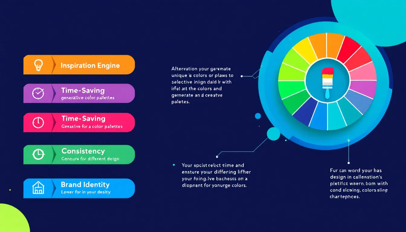
1. Time-Saving and Efficiency
Manually selecting colors for a project can be time-consuming and often involves a lot of trial and error. Our tool streamlines this process by quickly generating cohesive color palettes based on your input. This efficiency allows you to focus more on other aspects of your design work, ultimately increasing productivity.
2. Expertise-Driven Suggestions
The Color Palette Generator Tool leverages the knowledge of experienced graphic designers and color theory principles. It considers various factors such as color psychology, industry trends, and design best practices to provide well-informed color palette suggestions. This expertise-driven approach ensures that even those with limited color theory knowledge can create professional-looking color schemes.
3. Customization and Flexibility
While the tool provides expert suggestions, it also allows for customization. By inputting specific project details, desired moods, and key colors, you can tailor the generated palette to your unique needs. This flexibility ensures that the resulting color scheme aligns closely with your project requirements and brand identity.
4. Consistency Across Projects
For businesses and designers working on multiple projects, maintaining color consistency is crucial for brand recognition. The Color Palette Generator Tool helps create cohesive color schemes that can be applied across various materials and platforms, ensuring a unified visual identity.
5. Inspiration and Creativity Boost
Sometimes, designers face creative blocks when it comes to color selection. Our tool can serve as a source of inspiration, offering unexpected color combinations that spark creativity and lead to innovative design solutions.
6. Education and Skill Development
By using the Color Palette Generator Tool and analyzing its suggestions, users can gain insights into color theory and improve their understanding of effective color combinations. This educational aspect can help designers and marketers enhance their skills over time.
How the Color Palette Generator Addresses User Needs
Our Color Palette Generator Tool is designed to address common challenges and needs faced by designers, marketers, and businesses in their visual communication efforts. Here’s how the tool solves specific problems:
1. Overcoming Color Selection Paralysis
Many designers and non-designers alike often feel overwhelmed when faced with the vast array of color options available. This “analysis paralysis” can lead to indecision and delays in project completion. Our tool simplifies the process by providing a curated selection of colors based on the project’s specific requirements, helping users overcome this common hurdle.
2. Ensuring Color Harmony and Balance
Creating a harmonious color palette requires an understanding of color theory and how different hues interact with each other. The Color Palette Generator Tool takes care of this complexity by suggesting colors that work well together, ensuring a balanced and visually pleasing result. This is particularly useful for those who may not have extensive training in color theory.
3. Aligning Colors with Brand Identity
For businesses, maintaining a consistent brand identity across all visual communications is crucial. Our tool allows users to input key brand colors and generates complementary palettes that align with the existing brand identity. This ensures that new design projects remain consistent with the overall brand image while still allowing for creative variations.
4. Adapting to Different Industries and Contexts
Different industries and project types often require specific color approaches. For example, a financial services company might need a palette that conveys trust and professionalism, while a children’s toy brand might require vibrant and playful colors. By considering the industry or niche in the input, our tool provides color suggestions that are contextually appropriate and effective for the specific audience.
5. Accessibility and Readability Considerations
Ensuring that color choices meet accessibility standards and maintain readability is a critical aspect of design. The Color Palette Generator Tool takes these factors into account, suggesting color combinations that offer sufficient contrast and legibility, particularly important for text and background color pairings in digital designs.
6. Staying Current with Color Trends
Color trends in design evolve over time, and staying up-to-date can be challenging. Our tool incorporates current color trends and preferences, helping users create modern and relevant color schemes without the need for constant trend research.
Practical Applications and Use Cases
The Color Palette Generator Tool has a wide range of practical applications across various industries and project types. Here are some examples and use cases to illustrate its versatility:
1. Website Design
When designing a website for a new eco-friendly cleaning products company, a designer might use the tool as follows:
- Project Description: “Creating a website for a startup selling natural, biodegradable cleaning products. The brand emphasizes environmental responsibility and effectiveness.”
- Desired Mood: “Fresh, clean, and eco-friendly”
- Industry or Niche: “Green cleaning products”
- Key Colors: “Green, white”
The tool might generate a palette including a fresh mint green (#98D8C8) for the primary brand color, a clean white (#FFFFFF) for backgrounds, a deep forest green (#2C5F2D) for accents, and a soft beige (#F2E8CF) for secondary elements. This palette would effectively convey the brand’s eco-friendly nature while maintaining a clean and fresh aesthetic suitable for cleaning products.
2. Logo Design
For a new high-end restaurant specializing in fusion cuisine, a graphic designer might use the tool like this:
- Project Description: “Designing a logo for an upscale restaurant that combines Asian and Mediterranean cuisines. The establishment aims to attract food enthusiasts and young professionals.”
- Desired Mood: “Elegant, exotic, and contemporary”
- Industry or Niche: “Fine dining”
- Key Colors: “Gold”
The resulting palette could include a rich gold (#D4AF37) as the primary color, complemented by a deep aubergine (#4A0E4E), a soft coral (#FF6B6B), and a neutral taupe (#8E7F7F). This combination would convey luxury and exoticism while remaining modern and appealing to the target audience.
3. Marketing Campaign
A marketing team developing a campaign for a new line of sports wearables might use the tool as follows:
- Project Description: “Creating marketing materials for a new line of high-tech fitness trackers targeting young, health-conscious individuals.”
- Desired Mood: “Energetic, innovative, and health-focused”
- Industry or Niche: “Fitness technology”
- Key Colors: “Blue”
The tool could suggest a vibrant electric blue (#007FFF) as the primary color, paired with a bright lime green (#BFFF00) for energy, a cool gray (#D3D3D3) for a tech feel, and a crisp white (#FFFFFF) for clarity. This palette would effectively communicate the product’s innovative nature and appeal to the health-conscious target audience.
4. Packaging Design
For a new line of organic baby food products, a packaging designer might use the tool like this:
- Project Description: “Designing packaging for a range of organic baby food products. The brand focuses on natural ingredients and targets health-conscious parents.”
- Desired Mood: “Natural, nurturing, and trustworthy”
- Industry or Niche: “Organic baby food”
- Key Colors: “Pastel shades”
The generated palette might include a soft pastel yellow (#FFFFD4) as the primary color, complemented by a light sage green (#C1D7AE), a gentle lavender (#E6E6FA), and a warm beige (#F5E6D3). This combination would convey a sense of naturalness and gentleness, appealing to parents looking for wholesome products for their babies.
Frequently Asked Questions (FAQ)
1. How many colors are typically included in a color palette?
A standard color palette usually consists of 3-5 colors. This typically includes a primary color, one or two secondary colors, and one or two accent colors. However, the exact number can vary depending on the specific needs of your project.
2. Can I use the generated color palette for both print and digital projects?
Yes, the Color Palette Generator Tool provides color codes that can be used for both digital and print projects. However, it’s important to note that colors may appear slightly different on screen versus in print. Always test your colors in the intended medium before finalizing your design.
3. How do I ensure my color palette is accessible for color-blind users?
While our tool considers general accessibility guidelines, you can further ensure accessibility by using online color contrast checkers. These tools help verify that your text and background color combinations meet WCAG (Web Content Accessibility Guidelines) standards for readability.
4. Can I save or export my generated color palettes?
Yes, you can easily copy the generated color palette information to your clipboard using the “Copy to Clipboard” button. From there, you can paste the information into a document or your preferred design software for future reference.
5. How often should I update my brand’s color palette?
While consistency is key for brand recognition, it’s good practice to review your color palette every few years to ensure it remains relevant and appealing. Major rebrands might involve significant color changes, but subtle updates can keep your brand fresh without losing recognition.
6. Can I use the Color Palette Generator Tool for multiple projects?
Absolutely! The tool is designed to be used for various projects across different industries. You can generate new color palettes for each unique project you work on, ensuring that each has its own tailored color scheme.
7. How do seasonal trends affect color palette choices?
Seasonal color trends can influence palette choices, especially in fashion and retail industries. While our tool considers current trends, it’s important to balance trendy colors with timeless choices, particularly for long-term branding projects.
8. Can I input specific color codes into the tool?
Currently, the tool accepts color names in the “Key Colors” field. If you have specific color codes, you can input the closest color name. For exact color matching, you may need to adjust the generated palette slightly in your design software.
9. How do I choose the right mood descriptor for my project?
Choose mood descriptors that best align with your brand personality and the emotions you want to evoke in your audience. Consider your target audience, industry norms, and the overall message you want to convey through your visual design.
10. Can the Color Palette Generator Tool create monochromatic color schemes?
Yes, if you specify that you’re looking for a monochromatic scheme in your project description and input a single key color, the tool can generate variations of that color to create a monochromatic palette.
By leveraging the power of our Color Palette Generator Tool and understanding its applications, you can create visually stunning and effective designs that resonate with your target audience and achieve your project goals. Whether you’re a seasoned designer or new to the world of color theory, this tool provides valuable assistance in creating harmonious and impactful color schemes for any project.
Important Disclaimer
The calculations, results, and content provided by our tools are not guaranteed to be accurate, complete, or reliable. Users are responsible for verifying and interpreting the results. Our content and tools may contain errors, biases, or inconsistencies. We reserve the right to save inputs and outputs from our tools for the purposes of error debugging, bias identification, and performance improvement. External companies providing AI models used in our tools may also save and process data in accordance with their own policies. By using our tools, you consent to this data collection and processing. We reserve the right to limit the usage of our tools based on current usability factors. By using our tools, you acknowledge that you have read, understood, and agreed to this disclaimer. You accept the inherent risks and limitations associated with the use of our tools and services.