Is this tool helpful?
How to Use the Custom Color Scheme Generator Effectively
This tool helps you create tailored color palettes for your website or app design by gathering key information about your project. Follow these steps to get the best results:
- Specify the Website or App Type: Clearly state the nature of your project. For example, you could enter “Online News Portal” or “Travel Booking App”. This helps the generator align colors with the industry and purpose.
- Define Your Target Audience: Describe who will use your site or app, including age groups or interests. Examples are “Active parents aged 30-45” or “Professional photographers”. This guides the color psychology considerations.
- Describe Your Brand Identity and Values (Optional): Share a brief overview of your brand’s personality or mission. You might write “Innovative startup promoting eco-tourism” or “Classic luxury brand with timeless elegance”. This lets the tool suggest colors that represent your brand’s character.
- Mention Design Trends to Consider (Optional): If you want to follow specific styles, include them here. For instance, “Dark mode with vibrant accents” or “Flat design with pastel tones”. The tool will integrate these trends into your palette.
- Generate Your Color Scheme: Click the generate button to receive a custom color palette complete with explanations on how the colors work together and suit your project.
After submission, the generator uses your inputs to create a practical, visually appealing color scheme that fits your needs and design goals.
What is the Custom Color Scheme Generator and Why Use It?
The Custom Color Scheme Generator is a design tool that crafts personalized color palettes specifically for websites and apps. By analyzing details about your project, audience, brand, and design preferences, it provides you with color combinations that enhance user experience, reflect brand identity, and follow modern UI/UX practices.
This tool saves you from the hassle of manually experimenting with colors and helps ensure your design looks professional, engaging, and accessible.
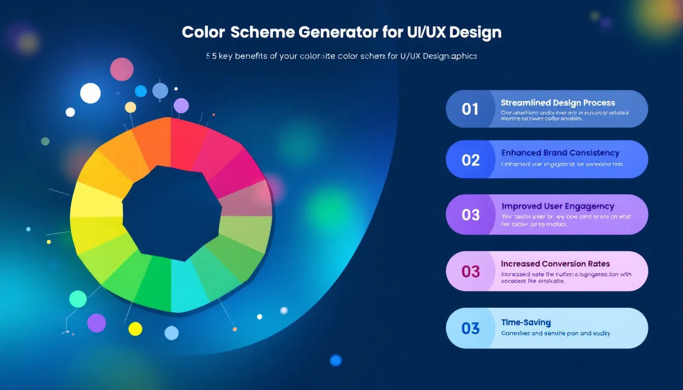
Key Benefits of Using This Color Scheme Generator
- Generate harmonious color palettes tailored to your specific project and audience.
- Save time by quickly creating multiple design options without guesswork.
- Align color choices with your brand’s identity and values for consistency.
- Incorporate current UI/UX color trends based on your preferences.
- Improve accessibility and visual clarity by applying industry best practices.
Practical Usage of the Color Scheme Generator
Designers, developers, and marketers can leverage this tool to fine-tune their projects. Here are several common ways it fits into your workflow:
1. Branding and Identity Alignment
Input your brand’s personality and core values to get color schemes that truly represent your message. For example, an environmentally conscious nonprofit can receive palettes with earthy greens and natural tones that reflect sustainability.
2. Audience-Specific Design
By describing your target demographic, you get color combinations that resonate with them emotionally and culturally. A site aimed at tech-savvy millennials might feature bold, modern hues, while a platform for elder users might have softer, higher-contrast colors for readability.
3. Staying Current with Design Trends
Mention recent trends like “glassmorphism,” “dark mode,” or “minimalism,” and the generator will produce palettes compatible with these styles, ensuring your design stays fresh and visually appealing.
4. Enhancing Accessibility and Usability
The tool selects colors with proper contrast ratios to improve legibility for all users, including those with visual impairments. This approach complies with web accessibility standards, improving overall user satisfaction.
5. Streamlining the Design Process
Instead of manually testing countless combinations, the generator quickly provides compatible color schemes, allowing you to focus on other design elements like layout and content.
Frequently Asked Questions About Color Schemes in UI/UX Design
Q1: How many colors should I include in my user interface?
A balanced UI typically uses between 3 and 5 main colors:
- 1-2 primary colors for main elements
- 1-2 secondary colors to support the primary palette
- 1 accent color for highlights and calls to action
- 2-3 neutral colors for backgrounds and text
Our generator follows these guidelines to ensure your design is harmonious and effective.
Q2: How does the tool support accessible color choices?
Accessibility is integral to color selection. The generator ensures:
- Sufficient contrast between text and background
- Color combinations suitable for users with color vision deficiencies
- Alternative color cues to avoid reliance on color alone for information
You should still test your designs using accessibility tools to guarantee the best user experience.
Q3: Can I customize the generated color palettes?
Yes, the suggested palettes serve as a solid foundation. You can adjust colors to better fit your brand or design preferences, experimenting with shades, tints, or different combinations.
Understanding Color Theory Basics for Designers
Knowing key color theory principles helps you make informed choices when using the generator or tweaking its output:
- Color Harmony: Selecting colors that complement each other on the color wheel to create balance.
- Color Temperature: Using warm (reds, oranges) or cool (blues, greens) tones to influence mood.
- Color Psychology: Leveraging colors to evoke feelings like trust, excitement, or calmness.
- Color Accessibility: Ensuring ease of readability and visibility across user groups.
Examples of Color Scheme Applications Across Industries
E-commerce Platform for Handmade Goods
Inputs: Website Type: Handmade Crafts Marketplace
Target Audience: Eco-conscious shoppers aged 20-40
Brand Identity: Artisanal, sustainable, friendly
Design Trends: Earthy tones with muted pastels
Suggested Colors: Warm terracotta, soft sage green, creamy beige, and charcoal gray.
Rationale: These colors evoke natural materials and authenticity, appealing to environmentally aware buyers.
Fitness Tracking App
Inputs: App Type: Personal Fitness Tracker
Target Audience: Young adults focused on health and activity
Brand Identity: Energetic, motivational, modern
Design Trends: Bold gradients and dark mode
Suggested Colors: Neon blue, vibrant orange, dark slate, and light gray.
Rationale: High-contrast colors energize users and fit well with trending dark mode aesthetics.
Nonprofit Organization Site
Inputs: Website Type: Community Outreach
Target Audience: Local residents and volunteers
Brand Identity: Trustworthy, compassionate, inclusive
Design Trends: Minimalist with soft accents
Suggested Colors: Soft blues, gentle coral, white, and medium gray.
Rationale: The palette conveys approachability and professionalism while maintaining a clean look.
How the Custom Color Scheme Generator Supports Effective UI/UX Design
Your color choices influence how users experience your digital product. This generator helps you:
- Create visual hierarchies that guide user focus
- Enhance readability and reduce eye strain
- Reinforce your brand’s identity through color consistency
- Improve overall engagement with emotionally resonant palettes
- Maintain accessibility for a diverse user base
Using this tool, you streamline the design process and make confident, data-informed color decisions tailored to your unique UI/UX project.
Important Disclaimer
The calculations, results, and content provided by our tools are not guaranteed to be accurate, complete, or reliable. Users are responsible for verifying and interpreting the results. Our content and tools may contain errors, biases, or inconsistencies. Do not enter personal data, sensitive information, or personally identifiable information in our web forms or tools. Such data entry violates our terms of service and may result in unauthorized disclosure to third parties. We reserve the right to save inputs and outputs from our tools for the purposes of error debugging, bias identification, and performance improvement. External companies providing AI models used in our tools may also save and process data in accordance with their own policies. By using our tools, you consent to this data collection and processing. We reserve the right to limit the usage of our tools based on current usability factors.