Data Presenter: Transform Complex Information into Engaging Visualizations

Transform complex data into compelling, audience-friendly presentations with our Data Presenter tool. Analyze trends, create impactful visualizations, and communicate insights effectively across various data types and audience levels.

Specify the nature and source of the data you want to analyze.

Indicate the audience's familiarity with the subject matter.

Describe any particular aspects of the data you want to highlight (Optional).

Specify any preferred visualization methods (Optional).

How to Use the Data Presentation Expert Tool Effectively

The Data Presentation Expert Tool is designed to help you create engaging and informative presentations of complex data. Here’s a step-by-step guide on how to use this tool effectively:

  1. Specify the Type of Data: In the first field, enter the type of data you want to analyze and present. For example, you might input “Global climate change statistics” or “Customer satisfaction survey results from Q3 2023”.
  2. Identify Your Audience: In the “Level of understanding of the intended audience” field, specify your target audience’s familiarity with the subject matter. For instance, you could enter “Environmental science students” or “C-level executives with limited statistical background”.
  3. Highlight Key Insights (Optional): If you have specific aspects of the data you want to emphasize, enter these in the “Specific insights or trends to focus on” field. For example, “Correlation between rising temperatures and extreme weather events” or “Impact of new product features on customer loyalty scores”.
  4. Choose Visualization Preferences (Optional): If you have preferred types of visualizations, enter these in the last field. You might input “Interactive heat maps and animated time series graphs” or “Infographics with icon-based representations”.
  5. Generate the Presentation: Click the “Generate Data Presentation” button to create your customized data presentation strategy.

Once you’ve submitted your request, the tool will process your inputs and provide a comprehensive strategy for presenting your data effectively. You can then copy this strategy to your clipboard for further use in your presentation preparation.

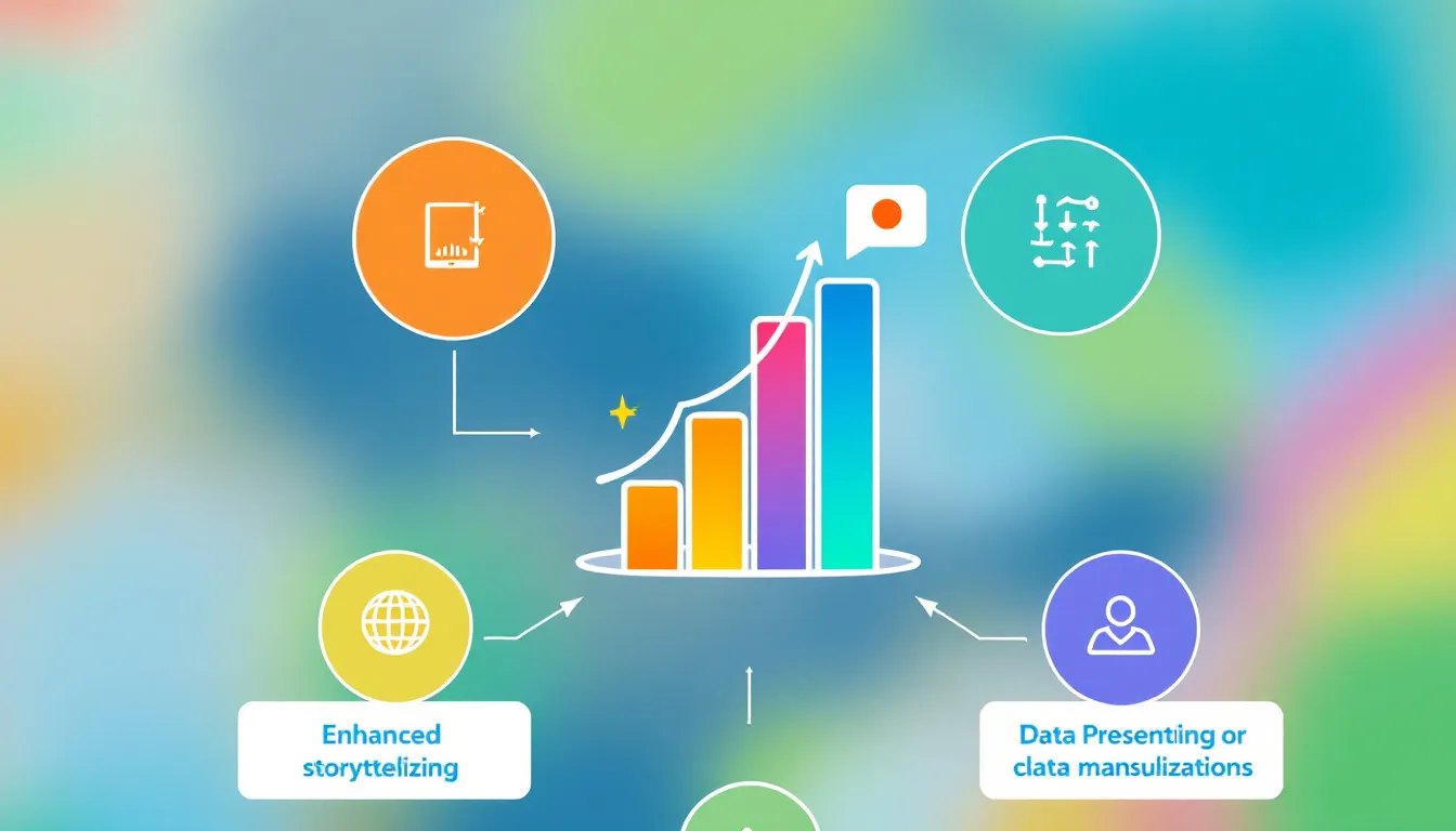
Introducing the Data Presentation Expert Tool: Your Gateway to Impactful Data Communication

In today’s data-driven world, the ability to effectively communicate complex information is more crucial than ever. The Data Presentation Expert Tool is a cutting-edge solution designed to bridge the gap between raw data and compelling narratives. This innovative tool empowers users to transform intricate datasets into clear, engaging, and impactful presentations tailored to diverse audiences.

Whether you’re a researcher presenting climate change findings, a marketing professional showcasing campaign results, or a business analyst reporting on market trends, this tool is your ally in making data accessible and meaningful. By combining advanced data analysis techniques with customized visualization strategies, it ensures that your message not only reaches your audience but resonates with them.

The Purpose and Benefits of the Data Presentation Expert Tool

The primary purpose of this tool is to democratize data presentation, making it possible for individuals at all levels of expertise to create professional-grade data visualizations and narratives. It serves as a virtual data communication expert, guiding users through the process of transforming complex information into clear, compelling stories.

Key benefits of using this tool include:

  • Time Efficiency: Rapidly generate presentation strategies that would typically require hours of brainstorming and research.
  • Audience-Centric Approach: Tailor your presentation to your specific audience’s level of understanding, ensuring maximum impact and engagement.
  • Enhanced Data Interpretation: Uncover key insights and patterns in your data that might otherwise be overlooked.
  • Versatility: Adapt to various types of data and presentation needs, from scientific research to business reports.
  • Improved Decision-Making: By presenting data more effectively, you enable better-informed decisions across your organization or field.

The Power of Effective Data Presentation: Why It Matters

In an era where data is often hailed as the new oil, the ability to refine this raw resource into actionable insights is invaluable. Effective data presentation is not just about creating pretty charts or graphs; it’s about telling a story that drives understanding, engagement, and action. Here’s why mastering data presentation is crucial:

1. Bridging the Knowledge Gap

Complex data can be intimidating, especially for those without a technical background. Skillful data presentation acts as a bridge, making intricate information accessible to a broader audience. This democratization of knowledge is essential for informed decision-making at all levels of an organization or society.

2. Enhancing Retention and Recall

Visual information is processed 60,000 times faster than text by the human brain. When data is presented visually and coherently, it becomes significantly more memorable. This enhanced retention is crucial when you’re trying to convey important insights that need to drive action or change.

3. Facilitating Pattern Recognition

Well-presented data allows viewers to quickly identify trends, patterns, and anomalies that might be hidden in raw numbers or text. This rapid pattern recognition can lead to faster decision-making and more intuitive understanding of complex situations.

4. Driving Engagement and Action

When data is presented in an engaging and relatable way, it’s more likely to inspire action. Whether you’re trying to motivate a team, convince stakeholders, or inspire public action, effective data presentation can be the difference between passive acknowledgment and active engagement.

5. Enhancing Credibility

Clear, professional data presentation enhances the credibility of your message and your expertise. It demonstrates a thorough understanding of the subject matter and an ability to communicate complex ideas effectively.

How the Data Presentation Expert Tool Addresses User Needs

The Data Presentation Expert Tool is designed to address a wide range of user needs in the realm of data communication. Let’s explore how this tool solves specific problems and meets the diverse requirements of its users:

1. Tailoring Content to Audience Expertise

One of the most challenging aspects of data presentation is adjusting the content’s complexity to match the audience’s level of understanding. The tool addresses this by allowing users to specify their audience’s expertise level.

For example, if you input “High school students with basic statistics knowledge” as your audience, the tool might suggest:

  • Using simple, jargon-free language to explain concepts
  • Incorporating relatable examples to illustrate data points
  • Utilizing basic chart types like bar graphs and pie charts
  • Including brief explanations of any statistical terms used

Conversely, if you specify “Data scientists at an AI conference” as your audience, the tool might recommend:

  • Using more technical language and advanced statistical concepts
  • Incorporating complex visualizations like neural network diagrams or multi-dimensional scatter plots
  • Focusing on methodological details and cutting-edge analytical techniques
  • Emphasizing the novelty and technical implications of the findings

2. Highlighting Key Insights

Often, presenters struggle to identify and emphasize the most important aspects of their data. The tool addresses this by allowing users to specify key insights they want to focus on.

Let’s say you’re analyzing sales data and input “Regional variations in product performance” as a key insight. The tool might suggest:

  • Creating a heat map of sales performance across different regions
  • Using a stacked bar chart to compare product categories across regions
  • Incorporating small multiples to show trends for each region side by side
  • Suggesting narrative elements that explain factors contributing to regional differences

3. Choosing Appropriate Visualizations

Selecting the right type of visualization for your data can be daunting, especially with the multitude of options available. The tool simplifies this process by recommending visualization types based on your data and goals.

For instance, if you’re working with time-series data on climate change and specify “Interactive visualizations” as a preference, the tool might recommend:

  • An interactive line graph showing temperature changes over time, with the ability to zoom in on specific periods
  • A dynamic map that shows changes in various climate indicators across different regions over time
  • An animated bubble chart that illustrates the relationship between CO2 emissions, temperature change, and sea level rise over decades

4. Crafting a Coherent Narrative

One of the most valuable aspects of the Data Presentation Expert Tool is its ability to help users craft a coherent narrative around their data. It doesn’t just suggest visualizations; it provides a framework for telling a compelling story with your data.

For example, if you’re presenting market research data, the tool might suggest a narrative structure like this:

  1. Start with a high-level overview of the market landscape
  2. Zoom in on your company’s position within this landscape
  3. Highlight key trends that are shaping consumer behavior
  4. Present data on how your product addresses these trends
  5. Conclude with projections and recommendations based on the data

This narrative approach ensures that your presentation is not just a collection of facts and figures, but a cohesive story that engages your audience and drives your point home.

Practical Applications and Use Cases

The Data Presentation Expert Tool has a wide range of practical applications across various fields. Let’s explore some specific use cases to illustrate its versatility and effectiveness:

1. Business and Finance

Scenario: Quarterly Earnings Report Presentation

A CFO needs to present the company’s quarterly earnings to the board of directors and shareholders. They input the following into the tool:

  • Data Type: “Q3 2023 financial performance data”
  • Audience Level: “Mixed – Board members and shareholders with varying financial expertise”
  • Key Insights: “Revenue growth in emerging markets, Cost reduction initiatives impact, Comparison with industry benchmarks”
  • Visualization Preference: “Clear, professional charts with year-over-year comparisons”

The tool might suggest:

  • A waterfall chart showing the factors contributing to overall revenue growth
  • A split bar chart comparing cost structures before and after reduction initiatives
  • A radar chart positioning the company’s key metrics against industry averages
  • A narrative structure that starts with the big picture, drills down into specific areas of success, addresses challenges, and concludes with future projections

2. Scientific Research

Scenario: Presenting Climate Change Research Findings

A climate scientist needs to present research findings to a mixed audience of policymakers and environmental activists. They input:

  • Data Type: “Long-term climate data and future projections”
  • Audience Level: “Mixed – Some scientific background, but not all experts”
  • Key Insights: “Acceleration of global temperature rise, Impact on biodiversity, Effectiveness of current mitigation strategies”
  • Visualization Preference: “Interactive and engaging visuals that convey urgency”

The tool might recommend:

  • An interactive time series graph showing temperature changes over the past century, with projections for different emission scenarios
  • A dynamic map illustrating biodiversity loss hotspots and their correlation with temperature changes
  • A Sankey diagram showing the flow of carbon emissions and the impact of various mitigation strategies
  • A narrative approach that starts with the global picture, zooms in on local impacts, and concludes with actionable mitigation strategies

3. Healthcare

Scenario: Presenting Public Health Campaign Results

A public health official needs to present the results of a nationwide vaccination campaign. They input:

  • Data Type: “Vaccination rates and disease prevalence data”
  • Audience Level: “General public and local health officials”
  • Key Insights: “Correlation between vaccination rates and disease reduction, Regional disparities in vaccine uptake, Cost-effectiveness of the campaign”
  • Visualization Preference: “Easy-to-understand visuals suitable for public communication”

The tool might suggest:

  • A before-and-after map showing disease prevalence rates across the country
  • A scatter plot illustrating the correlation between vaccination rates and disease reduction
  • A stacked bar chart showing vaccine uptake by region and demographic group
  • An infographic highlighting the cost savings and health benefits of the vaccination campaign
  • A narrative structure that emphasizes personal and community benefits, addresses common concerns, and provides clear calls to action

Frequently Asked Questions (FAQ)

1. Can this tool handle any type of data?

Yes, the Data Presentation Expert Tool is designed to work with a wide variety of data types, from financial metrics to scientific measurements, survey results, and more. It adapts its recommendations based on the specific nature of your data.

2. Do I need to have data visualization skills to use this tool?

No, you don’t need advanced data visualization skills. The tool is designed to provide recommendations and strategies that can be implemented even by those with limited experience in data visualization. However, having some basic understanding of data concepts can help you make the most of the tool’s suggestions.

3. Can the tool generate the actual visualizations for me?

The tool provides recommendations and strategies for creating effective visualizations, but it doesn’t generate the actual charts or graphs. You’ll need to use your preferred data visualization software (like Excel, Tableau, or R) to create the final visuals based on the tool’s suggestions.

4. How does the tool determine the best way to present my data?

The tool uses a combination of best practices in data visualization, principles of effective communication, and the specific inputs you provide about your data, audience, and objectives. It considers factors like the type of data, the level of complexity, the target audience, and the key messages you want to convey.

5. Can I use this tool for academic presentations?

Absolutely! The Data Presentation Expert Tool is valuable for academic presentations. It can help you structure your research findings in a way that’s clear and impactful, whether you’re presenting to peers at a conference or defending a thesis.

6. Is this tool suitable for real-time data presentation?

While the tool is primarily designed for preparing presentations in advance, its recommendations can certainly be applied to real-time data presentations. You can use the strategies it suggests to structure your approach to live data analysis and presentation.

7. How often should I use this tool in my data analysis process?

You can use the Data Presentation Expert Tool at various stages of your data analysis process. It’s particularly helpful at the beginning when you’re planning your approach to data analysis and presentation, and again near the end when you’re refining your presentation strategy. Some users find it valuable to consult the tool multiple times as their analysis evolves.

8. Can this tool help me present data to non-technical audiences?

Yes, this is one of the tool’s strengths. By specifying that your audience has a low level of technical expertise, you’ll receive recommendations tailored to making complex data accessible to non-technical audiences. This might include suggestions for using simpler chart types, incorporating more explanatory text, and using relatable analogies or examples.

9. How does the tool handle multi-dimensional data?

The Data Presentation Expert Tool is capable of providing strategies for presenting multi-dimensional data. It might suggest techniques like using small multiples, creating interactive dashboards, or using advanced visualization types like parallel coordinates plots or treemaps, depending on the nature of your data and your audience’s expertise level.

10. Can this tool help me create data-driven stories?

Absolutely! One of the key features of this tool is its ability to help users craft compelling narratives around their data. It provides suggestions for structuring your presentation in a way that tells a coherent story, highlighting key insights and guiding your audience through a logical progression of ideas.

By leveraging the power of the Data Presentation Expert Tool, you can transform complex data into clear, engaging, and impactful presentations. Whether you’re a seasoned data professional or new to the world of data communication, this tool empowers you to present your insights with confidence and clarity, driving understanding and action across diverse audiences.

Important Disclaimer

The calculations, results, and content provided by our tools are not guaranteed to be accurate, complete, or reliable. Users are responsible for verifying and interpreting the results. Our content and tools may contain errors, biases, or inconsistencies. We reserve the right to save inputs and outputs from our tools for the purposes of error debugging, bias identification, and performance improvement. External companies providing AI models used in our tools may also save and process data in accordance with their own policies. By using our tools, you consent to this data collection and processing. We reserve the right to limit the usage of our tools based on current usability factors. By using our tools, you acknowledge that you have read, understood, and agreed to this disclaimer. You accept the inherent risks and limitations associated with the use of our tools and services.

Create Your Own Web Tool for Free